

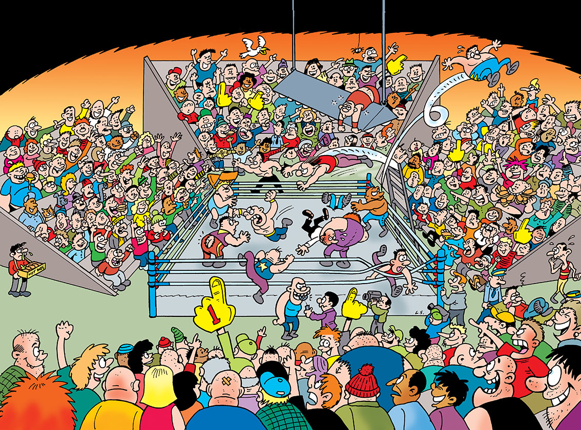
Toxic's I-Spy was not related in any way to the Sparky's I-Spy of course (although I did draw that too, for one issue of Fun-Size Dandy). The I-Spy spreads in Toxic were busy crowd scenes and the readers had to find various characters or items hidden in the picture. The editors of Toxic would supply me with the idea (such as "make this one a football game") and tell me what should be hidden in the image, but the rest of it was up to me.
There was another remit though. As it was for Toxic magazine, I was required to put "gross humour" in there. Snot and farts etc, but I didn't go overboard with it unless asked to.

All of the examples here appeared in Toxic about ten years ago in 2012. In fact the Wrestling Ring one is from exactly ten years ago this week. (It came up in my Facebook memories today, which inspired me to write this post.) These are the images as I sent them, so they don't have the logos and list of things to spot that the designers on Toxic would add on before publication. (You'll have guessed that the less busy areas in the images are where logos and typeset would go.)
These spreads required a lot of work, sometimes to a short deadline, so I used a quicker, more shorthand style on the characters at times. Hopefully it worked OK.

I miss working for Toxic. Sixteeen years on a mag is a long time, and it followed straight on from previous work I'd done for Egmont / Fleetway / IPC going back to 1986! At one stage I was the only cartoonist they were still employing, but nothing lasts forever of course. A few years back the inevitable budget cuts axed my work for Egmont completely. Toxic is still going, but its "gross humour" and traditional style of comedy is gone, replaced by U.S. reprint such as the modern style Yogi Bear of all things!
It was good while it lasted though, and I'm focusing on artwork I'm currently doing rather than pining for the past, but I thought that followers of my blog might like to see some of these spreads from 2012. As always, click on the images to see them at full size. (Best viewed on a laptop or desktop.)
 |
| Pencil rough of the Wrestling one. Finished version below. |

7 comments:
As a pro wrestling fan and a fan of your work this is a perfect crossover for me!
nicely done.
No offense to some of the artists that did them, but I have seen some .. mm i would say more modern? probebly ten years ago now, which did use digital trickies to fill out crowd scenes and have a bit of copy-pasting going on.. I can understand why and all but always felt like a cheat to me then you compare them to older stuff like casey court which often could pack more in by hand.. It's good to see ones which are done by hand ^_^
Love these. Remind me of the Baxendale Banana Bunch Spreads. YOu can spend many an hour just marvelling at the detail.
These are so good lew! Would these types of sketches be drawn on a3 sized paper? And why do you draw the draft with blue
pencil? Also, do you have any good inking recommendations? I'm thinking of getting back into drawing/sketching, your blog has inspired me, but I haven't done it in years.
Thanks
Oliver
They were drawn almost A2 size Oliver. So quite large! I use a blue pencil because the scanner doesn't pick it up when I scan the inks as a bitmap. I'd prefer to use an ordinary pencil but the ink in the fibre tip pens I use goes grey if I try to erase it so I use a blue pencil, ink over it, and don't erase.
Really like these, Lew! Am also reminded of the Moonsters in The Sparky, which also featured a large main frame with lots of stuff going on. What I particularly like about your frames is that there is more detail, as if 'zoomed out', if that makes sense. As Tiniebras says, you can just marvel at the detail. Particularly like the Christmas one showing the baby 'taking off' out of it's mother's arms!
Thanks Ian. The Moonsters was my favourite page in the early issues of Sparky. :)
Post a Comment